
Design System
12 March, 2018
When I joined Encompass in January 2017, I started by reviewing the application to determine the status quo. Reviewing a product is a great way to get to know your product and simultaneously perform an expert analysis at the same time. As you are new to nearly everything you don’t have to pretend to be a new user. If something is unclear, you probably just uncovered something to improve upon. Documenting these issues is important as you only experience this initial confusion once. As soon as colleagues have explained the situation you understand it, and will likely forget it was confusing in the first place.
During my review, I used a spreadsheet to document all the issues I encountered. I scored them, between 1 and 10 in regards to importance and priority.I discussed the list with the Head of Product. Using his domain and business knowledge, we adjusted the scores to be more realistic and added an effort score. We divided the list into themes, for example ‘search experience’, ‘data visualisation’. Segregating the issues by theme would allow me to focus on an area instead on one specific task at a time. Often a good (or bad) user experience is not determined by a single thing but rather by the combination of parts and how those parts interact.
encompass is the creator of KYC automation for major financial and professional service firms globally. It is the only provider of simultaneous, real-time access to multiple sources of global company and person data. By using robotic search to discover everything your KYC policy demands, encompass delivers more efficient processes and faster, safer regulatory compliance, resulting in lower costs and superior risk management.
The themes where prioritised and formed my UX roadmap for the foreseeable future. The first theme we choose to address was ‘quick wins’. This is a special theme with many small tasks that didn’t really fit in to any of the larger themes. The ‘quick win’ tasks all roughly shared the same scores, low effort and high impact. It allowed me to immerse myself into the work quickly, introduce myself to the development team and show the wider company the value I would bring.
At this point you might ask yourself, when users are introduced, and shouldn’t assumptions be validated with research. Unfortunately, Encompass had just pivoted before I joined and had no existing users in the new domain, making user testing and research impossible. I relied on my experience and knowledge to find flaws myself. In my opinion, you can achieve much by using your instinct, common sense and best practices.
Session expiry
One of the bigger and easier ‘quick wins’ was the session expiry experience. As a business requirement to protect application data the system would log out inactive users automatically. When a user logs in the system would create a token that would expire 20 minutes later. The user would be logged out when they performed a backend request with an expired token. Unfortunately it was not clear which actions had backend requests associated with them. Switching pages didn’t so users could happily navigate through the application with an expired token. This led to a strange experience, making it unclear for the user why all of the sudden they would be logged out when they finally performed an action with a backend request. Furthermore being logged out would send the user back to the login page. Logging back in would send the user back to the dashboard, losing context of where they were and what they did. You don’t need research to know this is bad UX.
The improvement I designed is a timer in the frontend that keeps track of user inactivity, i.e. no mouse movement and no keyboard activity. If the user interacts with the application the timer is reset. After 10 minutes expires without any activity a ‘Locked’ screen appears where the user is asked to re-enter their password to unlock the application. Unlocking the application takes the user back to where they were, losing no information at all. We even made sure that manually entered data, even though not saved to the database, is still there. So if users are now called away from their desk, upon their return the application is right there where they left it.
Design principles
Whilst doing my application review I noticed there was a lack of consistency in the application. Rather than solving the inconsistencies individually I decided it would be better to create a strategic plan, a design system. A design system would make it possible to validate the existing pages and also guide in the design process of future features, making sure consistency is maintained and scalable. I started by looking at company values, user goals and UX best practices to create a few underlying design principles. I knew these principles would still change so I did not spend too much time trying to make them perfect, just to establish some ground rules. I've listed a few examples below.
- One scrollbar, no nested scrollbars
- One primary button at a time on screen
- Touch support
- Don't rely on hover states
- Important information needs to meet contrast standards (secondary information less so)
Designing a design system
Looking at the application again I started a component analysis, I took screenshots of each new element I encountered. Each variation of a button, font style, dropdown, form layout, etc. Grouping all the variations of elements allowed me to decide what could become components and which ones are actually the same thing, just styled differently for no apparent reason.
Having designed design systems before I knew that the best way to design components is in a realistic setting, how components work together is equally important in a system as the components themselves. If you design your components in isolation they are going to look great but might not work too well together. For example the buttons and textfields in my system are the same height so that when they are placed side by side horizontally they look nice and line up, this only matters as that occurs occasionally in this application. In your application that might not happen and you needn't worry about it, but likely there are other combinations of components that will influence the styling of each.
The easiest way for me to test these compositions and combinations of components is by making an html prototype. The benefit it brings is that any rule you apply to a component, for example spacing or height, will automatically be reflected in your entire composition. If you do this in a design tool, you might have to update each individual component and spacing. Additionally you can define rules based on combinations of components, I use the CSS sibling selector + to define external spacing for components. Here is an example of what part of my CSS looks like for the paragraph component.
// Component style
p {
margin: 0;
padding: 0;
font-size: 14px;
line-height: 21px;
color: black;
}
// Component relations
h1 + p { margin-top: 20px; }
h2 + p { margin-top: 10px; }
Colours
After talking to the main frontend developer, I decided to create my prototype design system using the same CSS preprocessor he was using: Sass. Using the same CSS syntax would allow us speak the same language and simplify our workflow. I wanted the design system to be very flexible and easy to change so started with defining variables for colours. Based on a single hex colour I used the Sass mix function to mix a percentage of white or black to that base colour. Doing so multiple times allowed me to create a palette of colours that can be changed super easily by changing the base colour. From one base colour I derive 16 colours in total, named $color-neutral-0 to $color-neutral-f, using the hexadecimal system for the last character allows anyone familiar with that system to easily pick and adjust shades. $color-neutral-6 is the unchanged base colour. In the rest of the design system whenever a colour is used we use the variable. Later this proved to be extremely useful as we where going through a rebranding with slightly updated logos and colours. Changing the base colours was all it took to update all the components in the entire system to the new branding.
Below is the sass code I used for the primary colours, on each line you can see the percentages of black and white mixed with the base colour. The percentages are loosely based on a curve, making sure there is enough visual separation between each shade. Feel free to copy and adapt! These colours are easy to replicate in any design tool by putting them on either a black or white background and changing the opacity, that's how I came up with these numbers.
$color-primary: #43BDD8;
$color-primary-0: mix(black, $color-primary, 80%);
$color-primary-1: mix(black, $color-primary, 67%);
$color-primary-2: mix(black, $color-primary, 54%);
$color-primary-3: mix(black, $color-primary, 41%);
$color-primary-4: mix(black, $color-primary, 28%);
$color-primary-5: mix(black, $color-primary, 15%);
$color-primary-6: $color-primary;
$color-primary-7: mix(white, $color-primary, 14%);
$color-primary-8: mix(white, $color-primary, 29%);
$color-primary-9: mix(white, $color-primary, 43%);
$color-primary-a: mix(white, $color-primary, 56%);
$color-primary-b: mix(white, $color-primary, 67%);
$color-primary-c: mix(white, $color-primary, 76%);
$color-primary-d: mix(white, $color-primary, 84%);
$color-primary-e: mix(white, $color-primary, 91%);
$color-primary-f: mix(white, $color-primary, 96%);
Fonts
We were using Roboto in light grey as the main font at the time and users were complaining it was hard to read, especially during the training sessions where either a projector or tv would be used. I was not surprised to hear the complaints, the font was well below the suggested contrast ratio. I wanted to align the application more to what the marketing team was using for their designs to improve the user journey, from being exposed to marketing materials all the way to using the application. Having a consistent branding would improve the recognisability for users. I chose to use the marketing font for headers but a different one for body text. The body font marketing used was too complex, a font with character that makes sense to make you go “Hey, what’s that?” But that’s not what I needed, in an application you want a font that looks decent but doesn’t distract from the content. I chose Open Sans as it looks great on screen and is just a basic font, no questions asked. I beefed up the readability by using a minimum font-size of 14px (rather than 12px before) and changing the text colour to full black, #000000.
To keep the application uniform and simple, I only created 5 different font styles. H1, H2, H3, body copy and labels. Any component uses the body font, with the exception of some different colours for labels.
At vero eos
Et accusamus
Et iusto odio
Dignissimos ducimus qui blanditiis praesentium.
Components
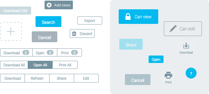
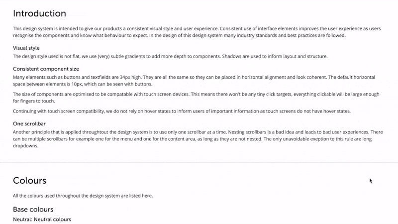
Using my fonts and colours as a basis I started designing components. For the buttons I wanted to use only 2 kinds, standard buttons and a primary action button. One of my principles was to have only one primary action button visible on screen at a time. This would allow me to use the primary action button as a guide, using it for what I believe the user should do next in their journey. So if the user is ever in doubt, follow the primary action button.
To make this work I needed the primary action button to stand out from the interface. I decided to use our brand's main blue colour to do that. It also meant the standard buttons needed to be a different colour and not distract from the primary action button. I choose white for the standard buttons. In previous projects I had used grey buttons but that was always a problem as they look too much like disabled buttons, especially if they don’t appear side by side it’s difficult to know what’s what. White buttons on a white background are a design challenge, using the right amount of shading is critical in making it look natural. It seems simple enough but I’m very happy with the way they look now.
I never really liked the pure flat design style as it is missing affordances to indicate what elements are clickable. Adding subtle shadows and gradients helps to remediate that. I added shadows and gradients to some components to make them stand out on the page. With gradients you need to be really careful to make it subtle, otherwise it immediately stands out that a gradient was used. Almost make it so faint that most people don’t even notice it, consciously. Initially I had a gradient on the white buttons but removed it later as it was too much. The blue button still has a subtle gradient. Both buttons have a shadow that emphasises the click-ability. Especially the contrast of removing the shadow for disabled buttons helps the user understand the difference. I added the same principle to more components such as radio buttons, checkboxes and switches. Clickable things have a shadow, non-clickable things don’t. This principle causes a non-selected radio button to have a shadow that disappears when it is selected. In contrast, a checkbox has a shadow regardless of it’s state as it is always clickable. It’s very subtle and I realise most people won’t notice it, but I hope that this level of consistency adds to a great user experience.
The size of the clickable components, such as buttons, checkboxes and radios might seem big at first. The reason for this is that I wanted to support touch screens. It is expected of a web product to work on tablets and it's getting more common for laptops to have touch screens. To be prepared for this I wanted to make sure our interface would be useable with a touch display. This affects the size of the components, but also stopped me to use hover states for anything meaningful. In the application we previously made heavy use of a right-mouse-click contextual menu. I had to change that as there is no mouse on a tablet. Having big buttons for an interface that is primarily used on a desktop machine might seem weird but it actually makes it easier to find stuff on screen and bigger buttons allow users to click on it more faster (Fitt’s law), even using a mouse.
Interactive prototypes
In previous positions I have often created interactive prototypes to illustrate my thinking and explain concepts to stakeholders. This has always been very well received as people can then see what the end result is going to be rather than having to imagine it, with different interpretations as a result. I wanted to be able to do the same at Encompass and decided to create my own prototype version of my design system. Being able to write HTML, JS and CSS really helped me in all of that. After discussing the current tech stack of the development team I decided to use SASS to write my CSS as that was also what they used. It would make the collaboration much easier and faster. Using real code was the easiest way for me to see the effect of how components interact with each other and allowed me to define rules. Doing this in a design tool like Sketch or Photoshop would have been very difficult.
Whenever I was designing a new feature I would design it using the new components and my design system. By doing this I could test whether the components worked and if necessary I would modify the design system to fit the situation better. It also allowed me to make the new designs future proof as I knew the design system would be implemented in the near future. When I showed my prototypes and mockups to developers this sometimes led to confusion as the mockups looked quite different from what they were used to. In hindsight, I should have made a second version of my design system where I adjusted the styles to mimic the existing style of the application at the time. That would have enabled me to show the same design in both styles.
Implementing a Component Library
A few months later the design system was maturing and I was hardly making any new components. This seemed like a good time to start the development of our component library. To recap, I first created a design system and only after using it for a few months as a design tool did we turn that into a component library that was to be used by developers. From what I understand most companies seem to do both at the same time. You don’t need to do that. By creating the design system first and using it during your design process for a few weeks or months you can test and validate the system before you use any developer resource. This way you can develop a better first version of the (developer) component library than otherwise possible. Updating an existing application to use new components is a huge task and you want to make sure you get it right.
I had the luxury of working with a very capable team of developers that was able to deliver more than expected in the time given. What I did not anticipate was the number of pages that required full redesigns on my part. Before we started the implementation, we had an expectation of what would be required. Our goal was to update all the components, not to change any behaviour or page layouts. I decided to not mock up each and every page as that would take a lot of time and might not be necessary. When we were in the process of updating the components it quickly became apparent that it was a good idea to mockup all the pages as the layout broke because of the new components. In a short time I had to mockup nearly all the pages in our application. A huge task but the end result was stunning, we had basically done half a redesign of the entire application instead of just updating some components. In order to get everything done I decided to extend our delivery date with 1 month so that we would have the time to iron out any bugs that might show up. When we launched a month later it was a great success with very positive responses from customers.
Fixing issues
As part of the implementation process I created a spreadsheet to keep track of all the issues that popped up. Many small things like updating the colour of a border. The spreadsheet was a very useful way of keeping track of the status of issues and who was dealing with them. Creating separate tickets in Jira, the ticketing system used by our development team, would have been overkill for all these small tasks. I prioritised all the issues based on how badly they were needed before the release, at some point there were over 200 items. Of course not all the issues were important for the release, no one other than me is going to notice that 1px difference. After the release our frontend developer simply continued working down the list, slowly chipping away until they were all done.
Education
In order to get the most out of the design system and component library we need more people to understand and use it. To do this I started writing descriptions for each of the components. These explain how, why and when each component should be used. How variations are intended and how components interact with each other. Our frontend developer added code snippets to it to inform developers how they can implement each component and variation. This will be a powerful resource for developers to be able to understand the components and help them with implementation. The intention is to improve the speed of development and reduce the frontend development work (reduce CSS code required). It has surprised me how many developers are not able to write proper CSS, most of them don't like to do it. We saw a lot of ugly inline styles and weird stuff that we removed during our initial implementation.
The second part of our education piece goes to the wider business and Business Analysts in particular. BAs are often required to come up with solutions to business requirements or bugs. With a good understanding of the design system they will be more capable of creating good solutions themselves. At the moment I am involved with nearly every UI change and where I am not I often see issues with the implementation afterwards. My goal is for the BAs to understand the system and have a way to create mockups themselves using the correct components. The reason for this is two-fold, giving them the responsibility to create mockups themselves will increase their understanding of the design system. This will make them more autonomous when dealing with questions from developers. If they make mockups then that frees up ux resource to focus on other things.
We are not there yet and we will need to work on a way to achieve this education. Until we have a design solution that allows the BAs to design using the actual components I explain as much as possible and always refer them back to the documentation. It has been amazing to read message threads where developers asked UI questions and seeing a BA giving the exact same answer as I would have done.
TLDR
- Application review
- Group all issues into themes
- Component analysis
- Redesign one theme at a time, create / adjust new components when necessary
- Test design system whilst designing new features
- Implement design system into component library
- Document use of components
- Educate wider business