Email Editor
September 4th, 2016
Movio Cinema offers a comprehensive film-centric solution that allows cinema marketers to identify specific audiences and develop personalized campaigns. These targeted campaigns are composed using our WYSIWYG email editor. We set out to redesign this email editor with the goal of using it to create all Movio Cinema campaigns, no matter what communication channel you use. The aim of this iteration was to build the email editing functionality of what will become our final updated Campaign Editor platform. This blog will go into how I approached the redesign from a UX perspective.
Why a redesign?
We knew there were some parts of the editor that needed attention, and we also noticed that our customers spent a lot of their time on this part of our product, so it was obvious that we should invest time in helping them get the most out of Movio Cinema.
By looking at the way marketers constructed their email campaigns I highlighted some areas that we could improve on, such as how to add and remove images, paragraphs and buttons.
Having recognized the frustrations of how this tool was functioning from our customers perspective, I was motivated to design a new Email Editor to improve the overall user experience.
One of the biggest issues our customers have is the way they have to construct their emails. You start out with a template that contains all the possible sections you can have in your email. You can remove sections you don't need and duplicate sections you need more of. The problem is that once a section is removed you can't add it back in later and you have to start over from scratch. This also applies to buttons, images and paragraphs inside sections.
Research
I started by analyzing competitor products and cataloged how certain functions worked in each product. This way I could identify the best user experience in each feature of every product and use them as inspiration for our redesign.

I interviewed Movio’s Account Managers about how their customers were using the existing product. It was very insightful to hear these real-life examples of how our product was used and about any frustrations that existed. This enabled me to really put myself in their shoes.
By comparing the templates that Movio Cinema had created for each customer with the actual emails that customers had sent I was able to analyze the way people actually used our product. This proved most valuable, I even noticed customers using different types of fonts and colors. We want our customer’s campaigns to look their best for their loyalty members and brand consistency plays a big part in achieving that.
Sketching
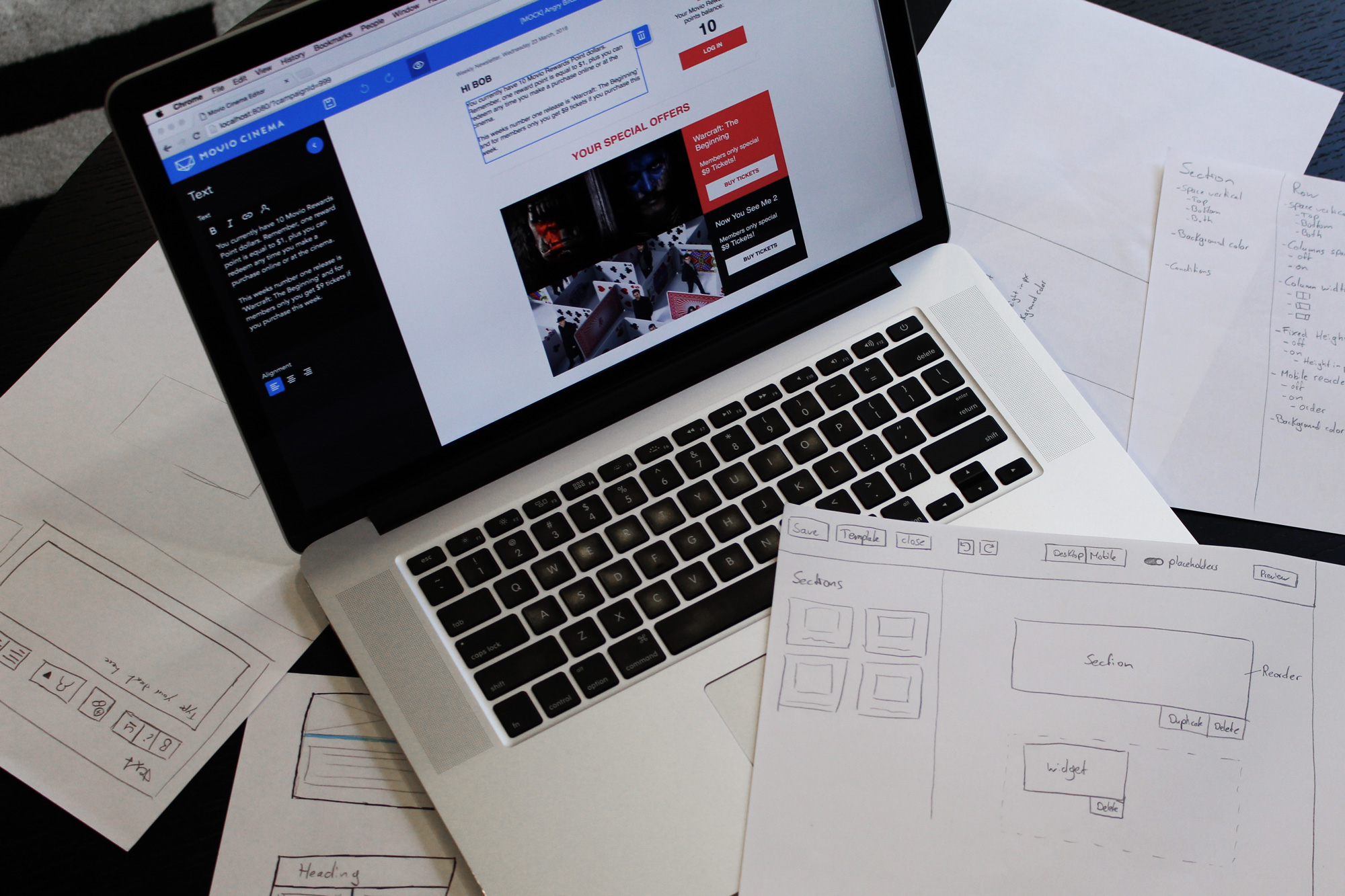
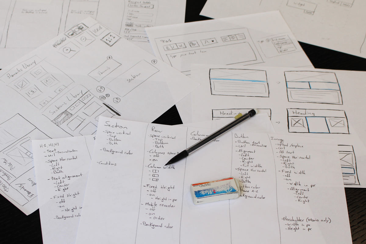
During the analysis, ideas already started to brew in my head. Writing and drawing them on paper helps me keep my head clean for new ideas. There where so many things to take into account for this project, for example:
- Technical limitations
- Feature support
- Simplicity
- Flexibility
- Email limitations
- Customer feedback
This meant lots of sketching, discussions and exchanging of ideas to refine my plan.

4 ingredients to a successful UX redesign
Following my research and planning stage I was ready to get started on the product. There are four main points that I covered which I’ll explain in further detail in this blog:
- Design for flexibility
- The balancing act – freedom and constraints
- Best practices inform design
- Clean interface
Design for flexibility
When designing any kind of software application, I always go a few steps further in the design than is required for the initial release. By doing this I can make sure that all the features that are likely to be implemented (and some that may never be) will fit into the application – it’s future proofed. It is very counter productive when you come to add a feature to a menu and find there is no space remaining to do so. Designing for flexibility means that it will be very easy to add features because you’ve already planned where they are going to go.
The balancing act – freedom and constraints
The Email Editor is effectively a design tool that lets its users create something new that didn't exist before, so, it allows for a lot of creative freedom. However, I decided more guidance was required to help our customers easily maintain consistency for their brand. This became a balancing act; with each feature I thought about the possibilities it would bring, good and bad.
A trend that was apparent during my research was the 'drag and drop' of individual components such as headings, texts, buttons etc. into the email which enables lots of freedom. It also begs the question, can you offer too much customization?
Thinking about the desired result our customers are looking to achieve, I decided it would be easier if we supplied pre-composed sections – a composition of headers, text boxes, images and buttons. This would mean that each section has its own purpose, such as an introduction or a specific movie offer. Building the desired email using these sections will be faster than dragging each individual component to the correct location and it makes it a lot easier to specify the correct layout for each section.
With the introduction of pre-composed sections that you drag into the email, you can now add what is needed instead of removing what you don’t need. This solves an issue our users encountered in the previous editor.
In the previous editor you can remove individual elements such as buttons, images and paragraps. In my new design, what would happen if you delete a button from the pre-composed section? How do you get it back? I didn’t want to add another collection of individual elements because there would no longer be any constraints on where the user can put these elements.
Allowing the user flexibility to change their minds during the email build is enabled via placeholders; whenever an element is deleted, it is simply just hidden as a placeholder. With the click of a button the user can show or hide all the placeholders. This ensures they can get buttons back after removing them, but also constrains them into where they can be placed. An extra advantage of placeholders is that our designers can actually 'suggest' extra elements in a section by adding them as placeholders.

Placeholders
Best practices inform design
While designing the new editor I investigated best practices for creating HTML emails. As explained in Movio's recent email best practice ebook 10 Tips to become The Godfather of Email you shouldn’t use too many CTAs, but rather keep your email to the point. The new placeholder idea lightly enforces this as a best practice. Another guideline is to keep your text short and engaging. The length of text depends on the width of the column. Text of normal length on a laptop might appear lengthy on a mobile phone because of its smaller screen. Since more than 50% of emails are currently opened on mobile phones, I wanted to encourage our users to keep the text short. I decided to make the textbox roughly the size of a phone to simulate a thinner column. That doesn’t mean the text can’t be longer, it’s just visually suggestive. We’re very keen to see how this will affect user behaviour going forward.

Clean interface
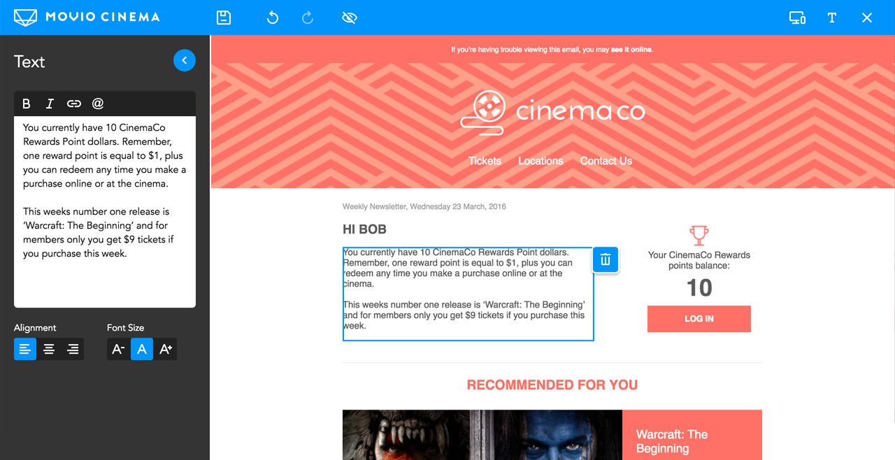
The updated interface of the Email Editor is clean and reactive, keeping distractions to a minimum and allowing the user to focus on their current task. The email is always visible, enabling a good overview of its current status. The colors of the interface have been kept to shades of gray with blue highlights (Movio Cinema's brand color). The colors are intended not to distract too much from the emails' own design and content.
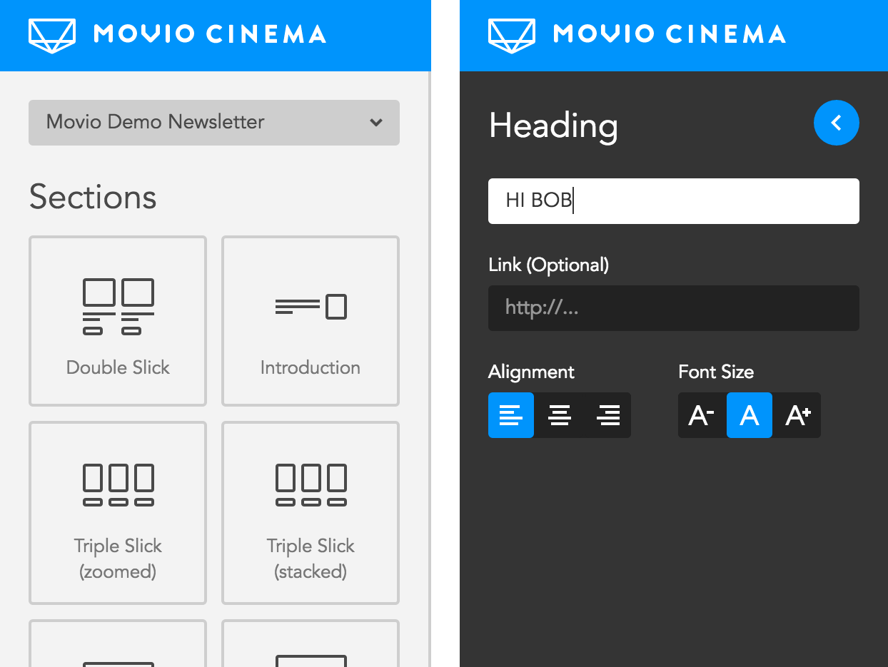
Editing structure and content is clearly divided in the interface. Structural changes are made directly on the email with the help of the sections library sidebar. Editing content, like texts, links, and uploading images happens in the properties sidebar. This sidebar appears and covers the section library when an object, such as an image, is selected, clearing up space for properties relevant only to the current task, in this case the selected image. These sidebars have a simple aesthetic and clearly distinguishable background colour, making it easier to instantly see which sidebar is currently active.

Originally published on Movio.co which includes Cristal Ramirez on real-world testing: 'The streamlined interface allows marketers to create an email quickly and effectively'.